Trust & Safety
Helping make dating safer for Tinder users online and IRL.
Design & UX
Design at Tinder was constantly evolving. My work included helping improve the branding, visual identity and level of design for features and elements that surrounded Trust & Safety while also contributing to and working with the overall design system. The work included putting users and user needs first and ensuring that we are solving user problems while creating the best user experience.
Strategy
All design projects included strategic thinking that often included the partnership of Designers and PMs. Our strategy involved ensuring that each project not only solved a specific business need but also was working to solve a user problem. This included defining our hypotheses, metrics for success, limitations, and scope. Strategy often included stakeholder meetings, brainstorms etc.
Research
The design teams work closely with our Consumer Research Team (Generative) and our User Experience Research Team (Evaluative) in order to create solutions that solved for user problems and user needs. To ensure this we worked with our Analytics Team as well as our Research Team to better understand the space before iterating on designs.
Reporting
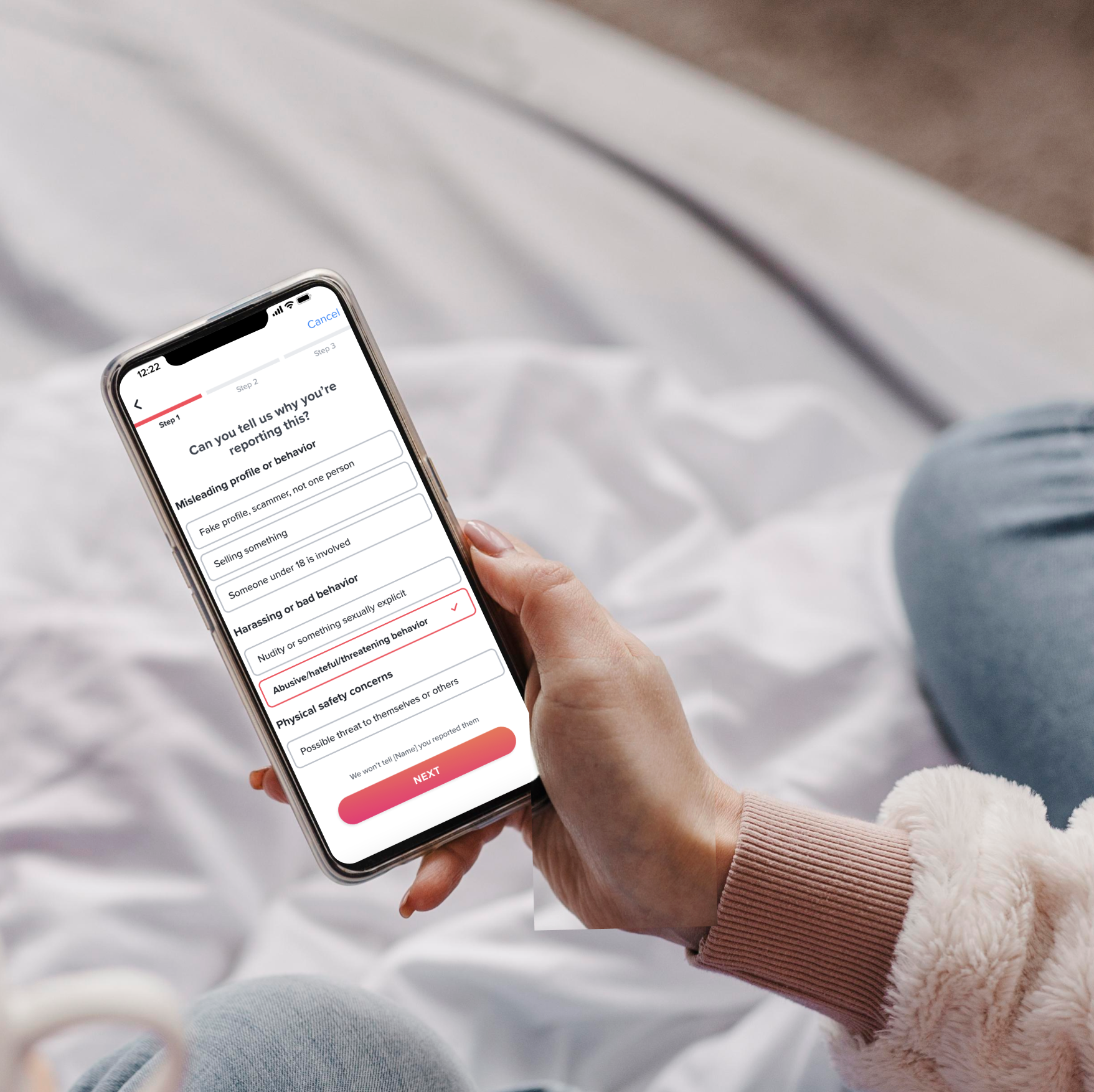
Reporting on Tinder allows users to report any online or offline incidents through various entry points, giving them a limited amount of reporting options that then are relayed to the moderation team.
Improved the UX and UI of reporting to make it easier for users to report any incident. Learn more about the problem, solution, process, limitations and my role by engaging with each section below.
-
The current reporting system and “tree” did not include options for users to report user-generated content (UGC). Additionally, the previous reporting designs used scrolling selectors that made it challenging for users to see what their reporting options are, and also made it difficult to select them. Additionally, the report options were outdated and didn’t include common report reasons that violated community guidelines.
-
To make it easier for users to find and select their reason to report, we switched from a focused scrolling button, to visible listed buttons. This also included grouping options with parent group headers. We also added a progress bar to let users know where they are in the process and what to expect next. For example “Harassing or Bad Behavior” became a parent category with sub options like “Nudity or something sexually explicit” or “Abusive/hateful/threatening behavior.” Other important violations were added for users to select that previously were not provided including “Sextortion,” “Trafficking” and other growing online trust and safety issues.
-
This project required restructuring our reporting tree on the backend and was a rather larger project. With my PM, we brainstormed the potential options we could make to accommodate UGC content into our existing reporting tree and worked with our engineers to find the option that had the lowest LOE, highest user impact within our timeline. I created multiple iterations, got feedback on the designs from the design team, trust & safety team and through user testing — which led to the final designs.
-
There were many limitations to this project which included time, engineering capability and UI. We were limited to using button design styles that already existed and that weren’t necessarily an optimized design and that didn’t allow for subdescriptors or large UI changes.
-
This project was co-led by me and my PM. Our initial directive was to improve reporting to accommodate our new user-generated profile content. After working with the team I helped us maximize the opportunity to make the discussed UI and UX changes that were within our scope.

Are You Sure?
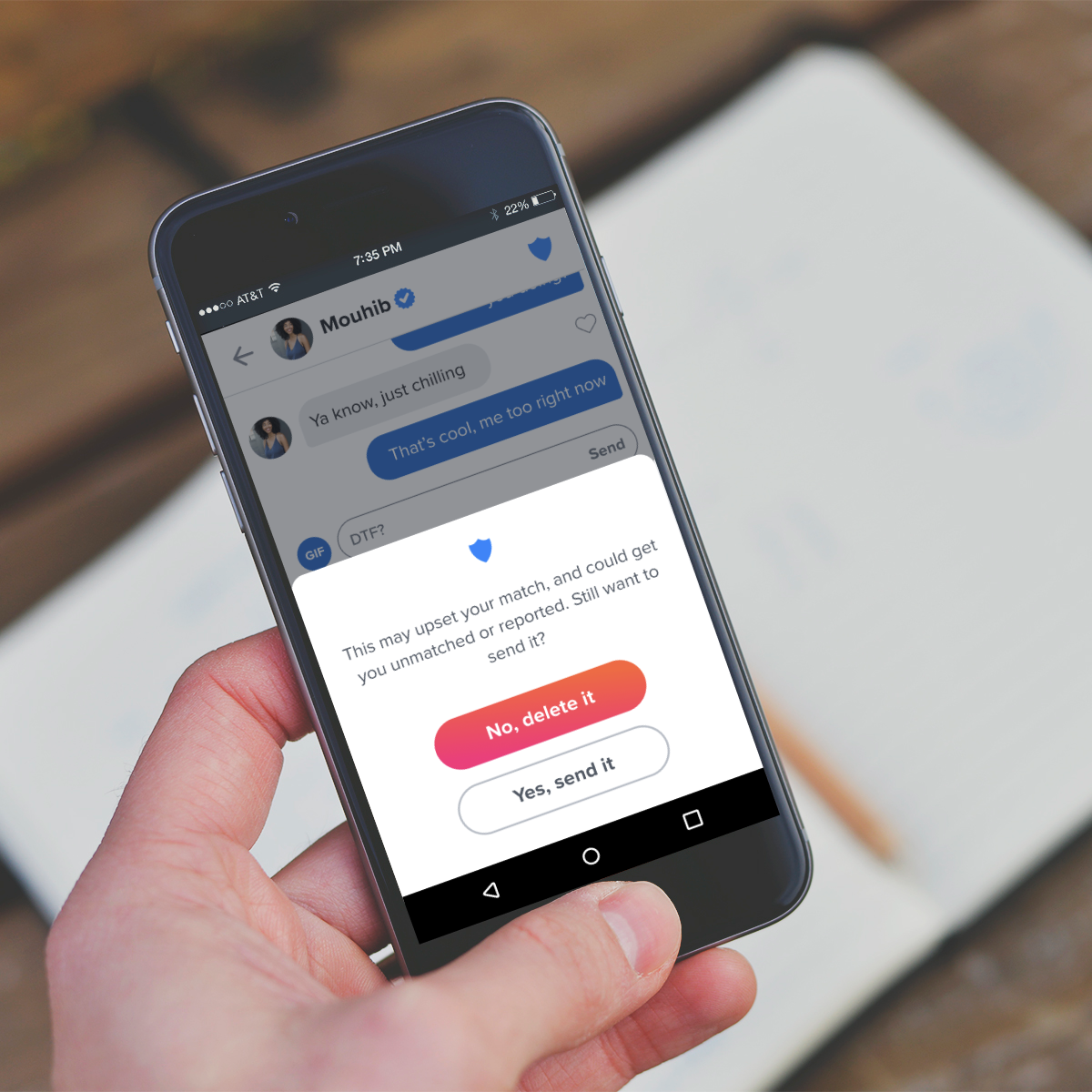
Released in 2020, Are You Sure (AYS) detects harmful language and proactively intervenes to warn the sender their message may be offensive, asking them to pause before hitting send. This design is an update to the AYS design, aimed at increasing user deletion of inappropriately detected messaging. With the new design, the message not-send rate increased from 1.9% to 3.2%.
Learn more about the problem, solution, process, limitations and my role by engaging with each section below.
-
The Are You Sure (AYS) feature was not getting interaction from users it prompted, and users were still sending the inappropriate messages detected. The team choose to revamp the feature in order to increase engagement and increase message not sent rates.
-
While often designers want to create the least amount of friction to users, the AYS feature is one which we wanted to increase friction in order to prevent bad messaging. The design changes included switching from an inline prompt that had no other CTA than for the user to delete the message on their own, to a bottom sheet which more prominently asked the user to both engage with it and decide if they want to send or delete their message.
-
Before moving to the bottom sheet design, the project included testing 5 different copy models based on input from the Yale Advisory team. The results yielded that users were most likely to delete messages when the copy was more formal and authoritative but did not shift the metrics enough to prevent bad messaging. After designing other options we tested the bottom sheet with the new copy which performed the best.
-
There were many limitations to this project. The detection model was outdated but we were unable to update it, and similarly we were unable to add other data indicators such as why someone would still send the message to learn if we were misdetecting or if the user simply didn’t want to change their message.
-
This project’s strategy and design was led by me in partnership with the PM, data and engineering team.
